From the outset, we were exacting in our demands:
1. The space bar must be the full size. This is no small thing, because NO ONE makes a 19cm wide space bar any more, and the injection moulding tooling for such a beast would cost thousands of dollars on its own.
2. The graphics symbols MUST be on the front, not on the top.
3. The shift and caps lock keys MUST be nice and clicky.
4. The whole thing must not in any way break the magic spell of 8-bit-ness.
Oh, and of course we have no money up-front to get the tooling made.
So we had set a high bar, and almost impossible conditions, and yet our friends at GMK have come to the party. And oh, how they have come. There really isn't anything more to say. I'll just show you some pictures.
The cases you can see in the first few shots are our 3D printed prototype cases: There is no CGI here -- just real objects.
What first struck me when I saw the first images, was that unless you really knew what you were looking for, you would have no idea that this was not an existing Commodore 65 prototype. This is of course exactly the effect we want to create :)
* The peg is an optional extra, not included in the standard package.
Trade-mark fun and games means you get the MEGA65 logo on the "Vendor Key". You can also see here that we have put an LED on the shift-lock and caps-lock keys, in the style of the old Amiga keyboards.
Our volunteer team went to a LOT of work to match the type-face of the original C65 keyboards. These keyboards just look so fresh and crisp, and yet so 1990, all at the same time.
Across to the right hand side now, all the usual suspects are there. We have also dealt with the "right cursor key rubs on case" issue that many original C65s had. Again, the look of the keys is excruciatingly close to the original.
Now the whole keyboard from above (We have just noticed that Blogger has munged the image resolution. We will try to get higher-res images up soon).
I'll just leave you in peace to take in the next few shots, before I comment again.
The discerning viewer might notice that the MEGA logo is bleeding together a bit in the little vertical gap. We will tweak this. Also, the printing on the fronts of the keys is currently black instead of grey, and there is a little over-bleed on the graphical symbols. We will also get this fixed. But even as it is now, I find that it is a thing of beauty, and would be just fine, but we are not satisfied with "just fine", we want to get as close to perfection as we can.
We can see here that the keyboard has a nice continuous slope to the key tops, nicer even than the original.
In this next shot, you can make out the extra ASCII symbols we have put on the front of some keys that on a C64/128/65 lack any graphics symbols. The symbols are {, }, _, ~, | and \, and will be accessed from native MEGA65 software by holding the MEGA key down. It will also be possible to patch C64 and C65 ROMs to support them. Backquote (`) is also avalilable as MEGA + the <- key, which can be spotted in some of the earlier photos. Having these missing symbols will make it much more pleasant to do more modern workflows, or even just programming in C, or any other language that uses curly-braces.
Now we look at the PCB. Due to some tight deadlines, the keyboards have a slightly wrong PCB outline. So we had two made with the correct PCB outline to fit into our case design, but that won't work, because lots of tracks have been cut.
Here you can see that we have a full metal plate in the keyboard. Combined with the CPLD and diodes, this will be a keyboard that has no ghosting when used natively (C64 and C65 ROMs will still have ghosting, if you don't change the keyboard scanning routines, because they don't have perfect provision for a non-ghosting keyboard mechanism. We might be able to work around this in the VHDL. We will see).
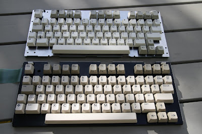
And now some side-by-side comparisons with an original C65 keyboard:


