While fixing some other bugs in the MEGA65 today, I took the opportunity to implement an improved character mode for clearer text. The basic idea is that in V200 text mode, i.e., 25 rows of text mode, that each row of pixels is vertically duplicated, because the native video mode is still V400. In this mode, we can instead interlace which of the two C64-style charset ROM areas we pull the pixel data from, and display them on alternate lines. Note that this doesn't result in flashy interlace, because it is a per-raster line interlace, not a per-frame interlace.
NOTE: This post describes an optional feature that has been added. The default behaviour remains the same, and the MEGA65 will keep on booting up looking like it always did. This just creates a new option for programmers (and users) to make use of, to give their MEGA65 a different look.
The change itself was quite simple, just checking if we are on the repeated pixel row for a character, and if so, and its coming from the character ROM, then use the alternate character ROM's data, if this feature is turned on via bit 4 of $D07A.
Here are some examples of the end result:
And now a bit of description of how I got there...
The first step was to enable bit 4 of $D07A on the new development bitstream I built that has support for this feature:
However, because the font is ASCII, and not C64 screen code order, the letters are all messed up. Also, we don't have reverse characters.
A bit more fiddling with fontmunge.c, and both of those issues are now resolved. I still don't do anything about the PETSCII graphics characters, as you can see in the shot below, but the text is there and looks really nice and crisp, after I turned off the CRT emulation!

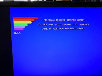
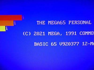
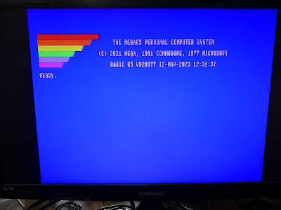
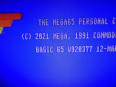
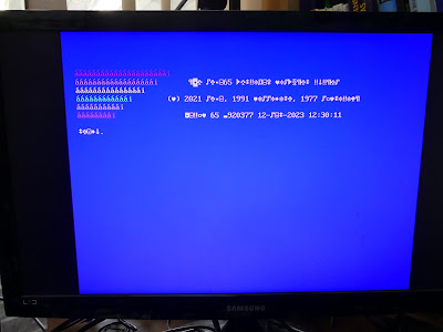

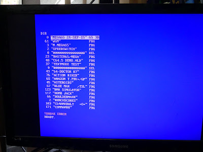
Nice, but the MSDOS font is really appalling on a C65. With its big brother in mind, Topaz would be a much more fitting font to use.
ReplyDeleteWhat I actually liked most was the fact the "9" was painted into the "V" at, as it looks, no cost. Nice calligraphic effect! The font itself is too DOSy for my taste...
ReplyDelete